“Responsive” Email
i guess it really shouldn’t be called “responsive” — it’s more “adaptive”. i mean, you can’t resize your browser or outlook window and expect it to update on the fly.

i’d like to say i’m pretty good at coding up html pages with css… and getting better and better at making sites responsive. well, only some of those skills are needed to code html emails
it’s a pain. a big one.
 get ready for a wonderful world of inline styling and tables upon tables upon tables. it’ll be tough to troubleshoot your code because what you need to investigate is probably 5 tables, rows, and cells deep.
so you write up your code and it looks pretty decent in Gmail (browser), Yahoo!, iPhones, iPads, Android phones. but what about Outlook ’07, ’13, et al? why does it look like that? why does it not respect your carefully crafted html that you spent hours on?
well, it turns out that Outlook renders HTML using Word. why? i think microsoft wanted more things for designers/developers to hate them for
example
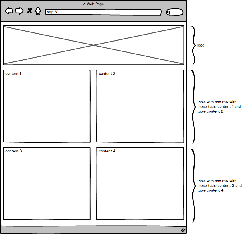
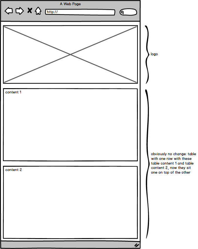
i had been tasked to make a two column newsletter that zippered into one when viewed on a smaller screen. zippered as in each module of the column kind of stacks on top of each other… first left, then right, then left, then right…
i code it up and it looks great in all those devices and services i listed above… except Outlook. One of my columns was not lined up properly. The columns would not line up at all until i found out this important bug: the outlook page break bug
people offer different ideas, but the one that worked for me was to basically make outlook break the content where i wanted it to. so instead of having a table that contained two tables side by side, i changed it to 3 tables stacked on top of each other
i even made a wireframe!
code
prevent microsoft from adding random spaces between your tables and tds by adding this:
table, td {
border-collapse:collapse;
mso-table-lspace:0pt;
mso-table-rspace:0pt;
}
- you can add media queries to emails. you gotta target your html elements using css attribute selectors
@media only screen and (max-width: 480px) {
table[class=content_wrap] {
width: 94%!important;
}
}
- whatever you need to stretch to the full width of the screen, class it and add this:
@media only screen and (max-width: 480px) {
table[class=full_width] {
width: 100%!important;
}
}
- didn’t forget about you, images
@media only screen and (max-width: 480px) {
img[class=max-size] {
width: 100%!important;
height:auto;
}
}
- make sure you have a width set for all tables, tds, and images
resources